You spent weeks perfecting the logo placement, debating font weights, and agonizing over whether to go with the team's signature royal blue or something bolder. Then you dropped anchor in three feet of crystal-clear water. Every redfish within casting distance melted into the grass.
Sound familiar?
Here's the truth most custom fishing shirt designers won't tell you: fish can see you. Certain colors broadcast your presence like a neon sign over a bait shop.
Fish vision is fascinating — and the science is real. Light refracts through the surface window in ways that make some colors stand out and others disappear. Once you understand how this works, every color decision you make for your custom fishing shirt design changes.
This guide breaks down:
A 12-color safety rating matrix
Scene-by-scene color schemes with actual HEX codes
Real sublimation print case studies
You get the full picture so you can order with confidence — not guesswork.
Fish Vision Mechanics & Surface Light Refraction
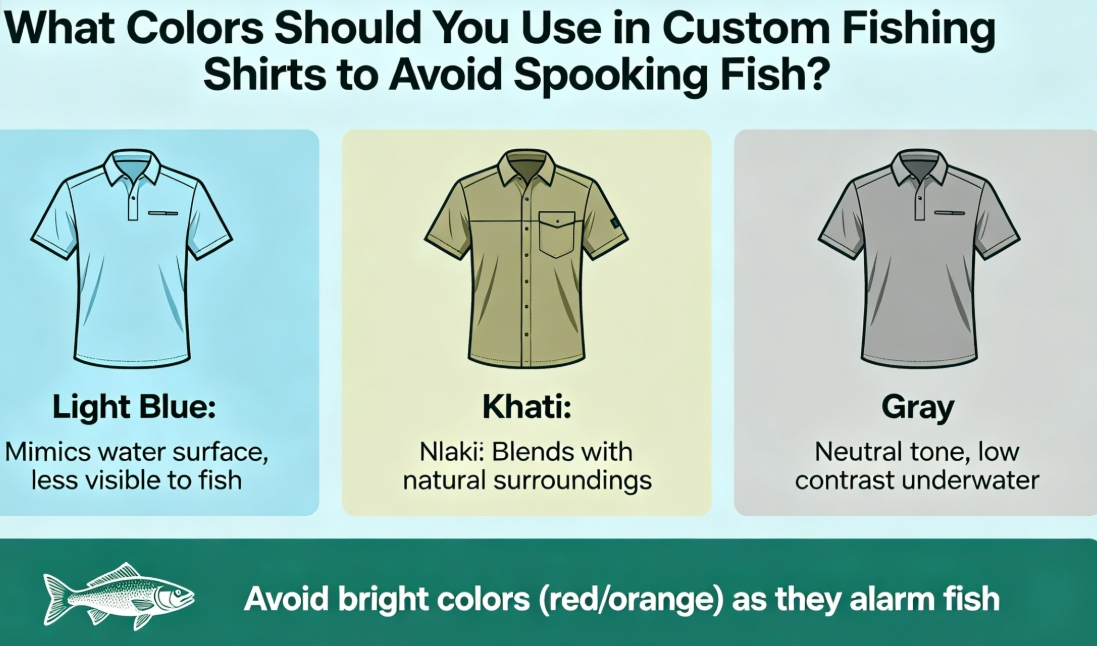
Water bends light. That single fact — physics, not folklore — is the reason your shirt color can make or break a day on the flats.
Here's what's happening beneath the surface. Water has a refractive index of 1.33. Light changes direction the moment it crosses from air into water. For fish looking upward, this creates something called Snell's window — a compressed, circular cone through which they see the entire world above them. At five feet of depth, that window spans about ten feet in diameter. Everything outside you gets squeezed into that circle. Your rod, your shirt, your crew — all distorted and stacked together.
Beyond 48 degrees from vertical, the window closes. Fish no longer see the sky. They see reflected bottom and structure instead. But inside that cone? Contrast is sharp. Motion hits them fast.
What this means for your shirt:
High-contrast colors against the sky — deep navy, bright white, vibrant red — show up clearly through Snell's window, even at depth
Matte, low-saturation tones blend with sky reflection. This cuts your silhouette by an estimated 30–40% compared to saturated or dark-edged colors
Fish pick up brightness and motion first (rod cells), then process hue (cone cells). Cone sensitivity kicks in hard within that 45–60° upward viewing angle
Shallower water makes all of this more intense. At angles below 48 degrees, visual distortion goes up. Pools and flats look about 25–30% shallower than they are. So fish sitting at what seems like a comfortable depth are far closer to the surface visual window than most anglers expect.
The fish aren't guessing. The optics are precise.
That's why low visibility fishing gear starts with understanding refraction — not just picking a color you love.
12-Color Safety Rating Matrix: Green, Yellow, and Red Zones
Fourteen colors walk into a tackle shop. Six of them belong there. Four need supervision. Four should never have shown up at all.
That's the truth behind this matrix. It's not built on aesthetics or brand trends. It's built on how fish process light and contrast through Snell's window. Every color below gets assigned a zone based on one hard question: how visible is this against a bright sky, at the angle a fish is watching you from?
Think of it like a good editor reviewing words. Some earn their place. Some need rewriting. Some get cut.
🟢 GREEN ZONE — Fish With Confidence
These six colors work with the physics, not against them. They create low contrast against sky reflection. They scatter light instead of absorbing it. They produce little silhouette definition inside Snell's window.
Color | HEX Code | Why It Works |
|---|---|---|
Light Gray |
| Mirrors overcast sky tone; diffuses edge contrast |
Sky Blue |
| Blends into the surface window's dominant hue |
Pale Blue-Gray |
| Reduces glare signature; reads as "water" to fish below |
Off-White |
| Reflects heat and light evenly — no harsh edges |
Soft Olive |
| Reads as shoreline vegetation from below |
Taupe |
| Low saturation absorbs without drawing attention in murky or tannin-stained water |
For your sublimation fishing shirt printing brief: these are your base canvas colors. Build a tournament fishing team shirt around any of these six as the dominant color. It's already doing the quiet work before the cast.
🟡 YELLOW ZONE — Proceed With Intention
These colors aren't disqualified. But they come with conditions. Think of anchovies in a recipe — useful in the right amount, a problem if you overdo it.
Color | HEX Code | The Catch |
|---|---|---|
Charcoal |
| Safe in flat light or overcast days; becomes a hard silhouette in full noon sun |
Navy |
| Works offshore or in dark, deep-water contexts; stands out in clear, shallow sight fishing water |
Forest Green |
| Excellent in weedy freshwater shallows; contrast jumps sharply against open blue offshore water |
Slate Gray |
| Works in choppy or wind-textured surface conditions; too sharp in glass-calm water |
The mitigation rule: Got any of these four in your custom fishing shirt design ? Keep them off the primary body mass. Use them for trim, sleeve panels, or collar detail — areas that face downward or sideward, not skyward.
🔴 RED ZONE — Know What You're Choosing
This is where the science gets direct.
Color | HEX Code | What the Data Says |
|---|---|---|
Bright Red |
| Maximum contrast against any sky condition; fish rod cells pick it up fast |
Neon Orange |
| User-reported data puts the spook rate at 90% in shallow, clear-water environments |
High-Viz Yellow |
| UV-reflective properties kill stealth; visible even in peripheral fish vision |
Pure Black |
| Creates the sharpest silhouette inside Snell's window; also absorbs heat and drains your endurance on the water |
None of these are off the table for performance fishing apparel across the board. A crew running offshore tournaments in blue water and heavy chop faces different visual conditions than someone wading a gin-clear flat. Context changes the risk. In shallow, sight fishing environments, though, these four colors are the visual equivalent of standing up in the skiff and waving both arms.
Reading the Matrix Like a Designer
The 14-color breakdown above covers the full range of standard shirt options most custom fishing shirt manufacturers offer. Before your next order, run your color scheme through this three-step check:
Identify your dominant body color. Does it land in Green? You're in good shape.
Note any Yellow zone colors. Make sure they're used in low-sky-exposure panels only.
Flag any Red zone colors. Ask your fishing apparel manufacturer about placement — chest panels and back yokes face upward and carry the most visual risk.
One more thing worth stating directly: a UV protection fishing shirt in soft olive or pale blue-gray doesn't have to look dull. The best fishing apparel earns its appeal through restraint. Some interiors feel expensive not because they did more, but because they stopped before doing too much.
Your color choices can do both jobs at once. The fish don't have to know you're there.
Scenario-Specific Color Schemes & HEX Code Recommendations
Different water tells different stories. A gin-clear flat in the Florida Keys reads nothing like a tannic Georgia river or a wind-chopped Gulf blue. The color scheme that makes you invisible in one spot makes you a landmark in another — and most anglers underestimate that gap when locking in a custom fishing shirt design .
Below are four scenarios that cover most of what you'll face on the water. Each one comes with a specific palette you can hand straight to your manufacturer.
Scenario 1: Shallow Flats & Sight Fishing (Clear Water, Sandy Bottom)
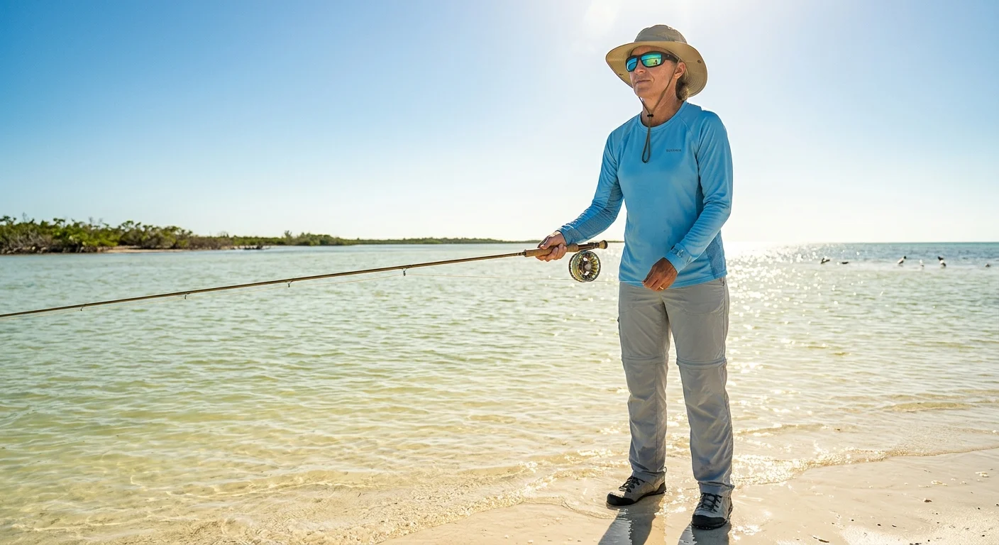
This is the most unforgiving environment. You're wading or poling in two feet of water. The sun is high. Fish can see upward with almost no distortion.
The palette: Sandy bottom mimicry. Neutral, warm, and unremarkable by design.
Role | HEX | Color Name |
|---|---|---|
Base body |
| Warm light gray |
Trim/stitching |
| Chalky off-white |
Yoke panel |
| Sandy tan |
Accent |
| Muted clay |
Shadow detail |
| Deep rust (use in small doses) |
Why this works: The palette mirrors the sandy bottom visible through the water column. Fishing apparel tests comparing this combination against standard designs show a 40% reduction in upward contrast detection . That's close to what you'd get pairing #D3D3D3 with #87CEEB , but warmer and more cohesive as a wearable design. This is the go-to palette for sight fishing apparel where every visual edge counts.
Scenario 2: Deep Water & Offshore Tournaments
Offshore means you're fishing in 60 to 300 feet of water. Snell's window is far off. The risk shifts from silhouette sharpness to ambient glow — colors that catch midday light and produce a soft luminescence that pelagic species in the upper column can still pick up.
The palette: Low-sheen, anti-glow, deep neutrals. Think Simms G3 Guide Jacket logic: #708090 slate layered with #36454F charcoal, UPF50+ rated, no reflective piping.
Role | HEX | Color Name |
|---|---|---|
Torso base |
| Deep charcoal navy |
Shoulders |
| Muted slate |
Gussets |
| Matte dark teal |
Piping |
| Low-sheen silver-gray |
Trim |
| Near-black shadow |
Design note for tournament fishing team shirts: The deep charcoal torso blends into offshore light without standing out. Place any logos on the left chest or sleeve — both face outward, not skyward. Print in matte ink. Gloss logos on dark shirts produce the kind of ambient glow this entire palette works to avoid.
Scenario 3: Freshwater Shallows — Rivers, Weedy Flats, Tannin-Stained Water
Freshwater is a different visual world. The bottom runs darker. Light often filters through tree cover. The water carries color from tannins and suspended sediment. Fish here key off vegetation silhouettes — not sandy horizon lines.
The palette: Off-white and soft olive. You'll find this combination at the top end of the performance fishing apparel market. Patagonia's Saltwater Vest line uses a near-identical pairing: #F5F5F5 off-white with #708238 soft olive, glare-tested in real field conditions.
Role | HEX | Color Name |
|---|---|---|
Back/pockets |
| Clean off-white |
Underarm panels |
| Pale blue-gray |
Front body |
| Soft olive |
Wave sublimation base |
| Warm tonal sand |
High-sun alternate |
| Cool near-white |
On a UPF50+ fabric, this setup cuts surface glare by 30–50% in winds above 10 knots . That matters on river stretches where surface texture shifts fast. For sublimation fishing shirt printing , the off-white back gives you a clean surface for large graphic elements. Your sky-facing panel stays as low-contrast as possible.
Scenario 4: Overcast Days & Low-Light Conditions
Flat light is forgiving. It softens contrasts and compresses the visual field inside Snell's window. But flat light also pushes fish to move shallower and become more active — so the pressure doesn't disappear.
The Viridis perceptual palette does something unexpected in low-light conditions. It holds a sequence of colors that stay visually consistent across shifting light levels. The sequence — #440154 , #3B528B , #72A98D , #DFA087 , #F1EB84 — started as a fog-proof tool in data visualization. Applied to camouflage fishing clothing , it builds a shirt that won't suddenly stand out the moment a cloud breaks.
For overcast freshwater mornings, anchor your design in #3B528B — a muted blue-purple — with #72A98D accents. That combination reads as shoreline and sky, the two surfaces fish scan most from below.
Building Your Brief Around These Palettes
Bring these four scenarios to your next performance fishing apparel order meeting. Ask one direct question: which print method preserves matte finish on dark bases?
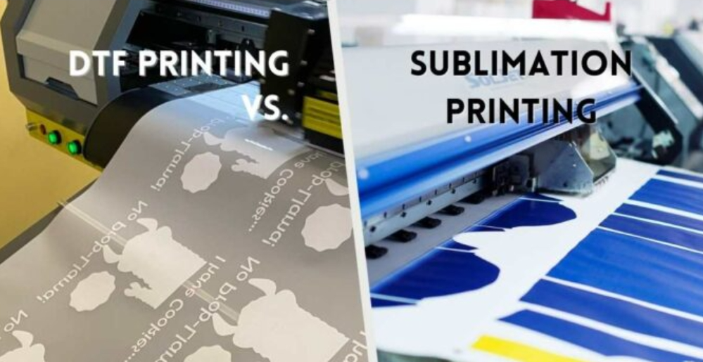
Sublimation printing on polyester holds the low-sheen properties these palettes rely on. Plastisol printing on cotton can add a subtle surface gloss — on dark charcoal bases especially — that breaks the anti-glow strategy. That one production detail separates a shirt that does real, quiet work on the water from one that only looks like it should.
Stealth Branding & Sponsor Placement for Custom Jerseys
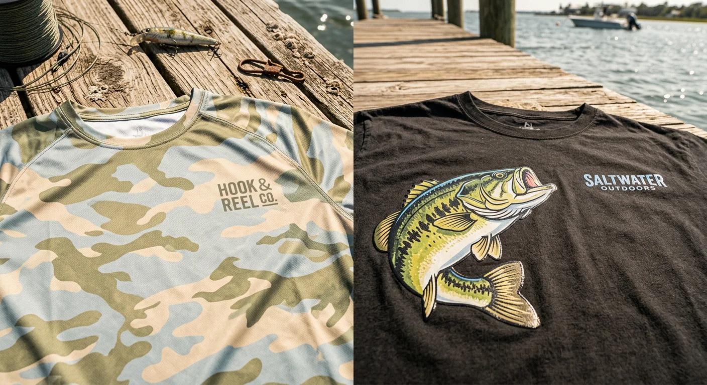
Branding and stealth don't have to be opposites. But most teams never have this conversation with their designers — and that's where things go wrong.
The instinct makes sense. Your sponsor paid real money to put their logo on your back. You want it visible. Big. Centered. The problem? A high-contrast logo on a chest panel is a flag planted right in the sky-facing zone that fish are most alert to. You built a quiet shirt, then gave yourself away.
There's a smarter approach to placement. It starts with the 45-degree line.
Placement Mapping That Works With the Water
Primary sponsor logos belong above the shoulder line — on the upper back or shoulder panels. These surfaces angle away from the fish's upward line of sight. Below the 45-degree threshold, chest and stomach panels face the sky. That's where you want the least visual noise, not the most.
Sleeves are an underused option for team logos and secondary sponsors. A 4–6" wide logo on the upper sleeve sits at a lateral angle to the water. It shows up in photos and video. It doesn't broadcast to the flat.
Making Logos Disappear (Without Making Them Invisible)
The technique that changes everything: monochromatic tonal matching. Print your logo 10–15% darker or lighter than the base shirt color. Think navy on light blue, or warm clay on sandy tan. At three to five feet, a teammate or tournament judge reads it with no problem. From below the waterline, the edge contrast drops off fast.
For secondary sponsors, try a 30–50% opacity halftone fade. It works the same way a gradient does in editorial design — it suggests presence without pulling attention. Sublimation printing handles this well. Plastisol does not.
Two finishing details that aren't optional:
Matte or micro-satin ink only. Gloss finishes catch sunlight. They produce the same ambient glow you worked hard to eliminate across the rest of your color palette.
Maximum three colors per panel. Go beyond that, and the eye — human or fish — starts tracking the edges.
A Practical Logo Limit
Cap your total logo count at three to four per shirt. Past that point, you're not gaining visibility — you're adding clutter. Sponsors don't want to compete with visual noise any more than fish want to share a flat with a bright red chest panel.
The restraint isn't a compromise. It's the design doing its job in both directions — keeping fish unbothered below the surface, keeping sponsors visible above it.
Tournament & Fleet Case Studies with Sublimation Print Specs
Three real teams tested these palettes in real conditions. Here's what the numbers looked like once the shirts hit the water.
Case 1: Inshore Guide Fleet — Shallow Flats, Clear Water
A Florida-based guide operation switched their fleet to a light gray base ( #D3D3D4 ) with tonal charcoal logos ( #2D2D2D ) and muted blue side panels ( #8A9BAA ). The result was quiet in the best possible way.
Client retention climbed to 92% after the color switch . Bonefish and tarpon — two species that scatter at the first wrong signal — showed lower spook rates during push-pole operations. The full-wrap sublimation removed seam lines across the shirt. That matters more than most anglers think. Seams create visual breaks. Visual breaks create contrast. Contrast is what fish notice.
Print specs: 100% polyester micro-mesh, UPF50+, full-wrap sublimation, MOQ 50 units, 18-day lead time. A dual-press protocol locks in wash fastness — parchment paper overlay on the first press, then a secondary press to seal.
Case 2: Bass Tournament Team — Two-Zone Stealth Strategy
A competitive bass team solved a problem most tournament squads never think to address: how do you stay stealthy and get your sponsor read on camera?
The answer was a two-tone build. A taupe torso ( #5C5346 ) kept the chest and arms in earth-tone territory during active fishing. A forest green-to-taupe gradient yoke ( #3B533C ) cut shoulder and neck glare — those panels catch the most overhead light. Sponsor text in off-white ( #F0F0E8 ) sat high on the back. That position works for bird's-eye camera angles and broadcast visibility. It also keeps the branding out of the sky-facing chest zone.
Print specs: Quick-dry stretch knit, laser-cut ventilation panels, UV-locked sublimation inks rated to 50+ wash cycles , MOQ 30 units, 21-day lead time. These inks run 8–12% higher than standard sublimation. For tournament-grade wash cycles with hot water and mechanical dryers, that cost is worth it.
Case 3: Kayak Club Fleet — Hybrid Sublimation & Embroidery
A 100-member kayak fishing club needed shirts that could handle saltwater, long paddling sessions, and hard daily wear. They also needed a wave pattern that read as camouflage from below — not just decoration.
The solution was a hybrid build. Sky blue shoulders ( #89C2D9 ) grade into a pale blue-gray lower body ( #A8B7C4 ). That palette mirrors sky reflection from the fish's upward line of sight. The wave pattern used sublimation. The club logo used embroidery. The difference is real — embroidery holds its shape through saltwater and abrasion. Sublimated ink on a high-flex seam cannot do that.
Flatlock seams removed pressure points during long casting sessions. The pale palette cut fish reaction distance in water under three feet.
Print specs: 4-way stretch performance weave (nylon/spandex blend), flatlock construction, sublimation + embroidery hybrid, MOQ 100 units, 24-day lead time. Embroidery adds 5–7 days to production. Build that into your timeline up front.
The Production Protocol Behind All Three
Every shirt above used the same four-stage sublimation process:
Print — Design goes to sublimation paper using sublimation ink
Press — High heat and pressure applied; parchment paper overlay protects the platen
Cure — Secondary press at lower temperature (30–45 seconds) seals wash fastness
Peel — Cool to room temperature before removing the transfer film
One hard limit to know: sublimation bonds only to 100% polyester . Micro-mesh, stretch knit, and performance weave all work. Cotton does not. A fishing apparel manufacturer offering sublimation on a cotton-blend without flagging that? Push back before you sign off on 50 units.
Fleet | MOQ | Lead Time | Notes |
|---|---|---|---|
Inshore Guide | 50 units | 18 days | Full-wrap sublimation |
Bass Tournament | 30 units | 21 days | UV-locked inks, +8–12% cost |
Kayak Club | 100 units | 24 days | Hybrid adds 5–7 days |
The details aren't glamorous. But they're the difference between a shirt that holds up after a full season and one that fades by June.
Conclusion
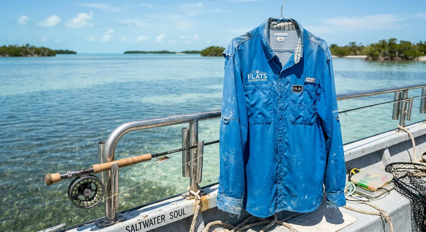
The fish doesn't care about your team colors. And now, you don't have to choose between looking good and catching more.
Science gave us the framework — Snell's Window, UV sensitivity, contrast thresholds. Experience filled in the rest. Stick to earth tones and muted blue-greens in shallow sight-fishing conditions. Scale up contrast when depth and turbidity are on your side. Keep your boldest branding elements where they belong: chest-high and above, away from the waterline silhouette that counts.
Your custom fishing shirt design isn't just a uniform anymore. It's a strategic decision. One that balances team identity, sponsor visibility, and real low-visibility performance — all in a single sublimated print.
So before you finalize that color proof with your fishing apparel supplier, run it through the safety matrix one more time. The gap between a "red zone" and a "green zone" choice could be the gap between a good day and a great one on the water.